As brands grow, every new touchpoint is a dilution risk. The counter to dilution is an anchor – one strong, core, immediately recognisable element that unites the current with the new. This unifying element isn’t always obvious – or it’s so obvious, you might be blind to it. In the rush of launch, there’s lots you haven’t had time to define yet – and growth exposes it.
We’ve watched countless brands grapple with more products, more channels, more people to keep aligned, and their own structural shifts. Their origin story gets further and further away. Teams get fatigue with existing assets. New packaging, socials, retail, campaign, website, and activation can start feeling like different interpretations of the brand.
Along these fault lines, customer familiarity can fail. It’s why at Springetts we first think in terms of brand life stages. And it’s how we nurture forever-level distinction.
Finding your form
Distinctive assets are the anchors that shore up the brand. And sometimes, they’re buried within the product itself – as for Weetabix, a design challenge that was about crafted stewardship. I’ll come to that story shortly, but first let’s explore the role and source of recognisable elements.
Icons that anchor the brand can be found in many places, including and beyond the logo.
The packaging. The shape of the bitten product (Solero lollies). Curves in the typography (the Cadbury’s ‘C’).
You might think there’s nothing ownable about an orange. But stick a straw in it and it’s unmistakeably Tropicana. And when replaced with a glass of juice in 2009, sales dropped 20% and lost the company $30 million.
The orange leaf isn’t always in the same place and sometimes the orange is sliced. That part doesn’t need total consistency. The stabbed-in straw makes it the distinctive symbol of pure fruit-to-bottle freshness.
Ask:
- What is becoming harder to control? What should be protected and systematised?
- Is there a way of treating greater constraint – rather than more expression – as creative infrastructure?
Repeatable meaning
No one really owns their brand – the audience does. Customers own it by knowing it, and associating it with occasions.
Jenni Romaniuk of Ehrenburg-Bass Institute lists ‘Shapes’ as one of the seven types of Distinctive Brand Assets. Even partially obscured shapes (and logos) are recognisable, because the brain organises visual parts into unified wholes automatically (Gestalt theory).
At the 2026 World Cup games, FIFA’s enforcing a strict “clean stadium” policy where brand names must be censored. But this is light work for a brand like Heinz, who made a marketing campaign out of its own laughable recognisability.
Shapes are so incredibly powerful. They are what get you recognised as cleanly in a thumbnail as across a supermarket aisle. But there’s a tension: the simpler the geometric form, the less ownable it is. The more complex, the less recognisable it is.
We see brands so distracted by the exciting pastures of new lines, new designs, new audiences, endless possibilities… that they abandon the shape before the shape has had a chance to earn its brand equity.
Sometimes a “fresh” overhaul can kill the shape and the spirit in the process.
The brands that can walk this line in the collective psyche (the Mercedes star, the Toblerone triangle) are the ones that travel across channels, formats, and decades.
Brands that do this well know what’s sacred. They don’t look for what’s most clever, most complex, what “pops” or shocks, or what’s evolved so far it feels you can’t wind it back. They look at what’s become loved, then amplify it – with considerable constraint and careful craft.
Ask:
- What’s the first thing that comes to customers’ minds when they think of the brand?
- More challengingly, what distinctive assets are you underusing because they feel too familiar internally?
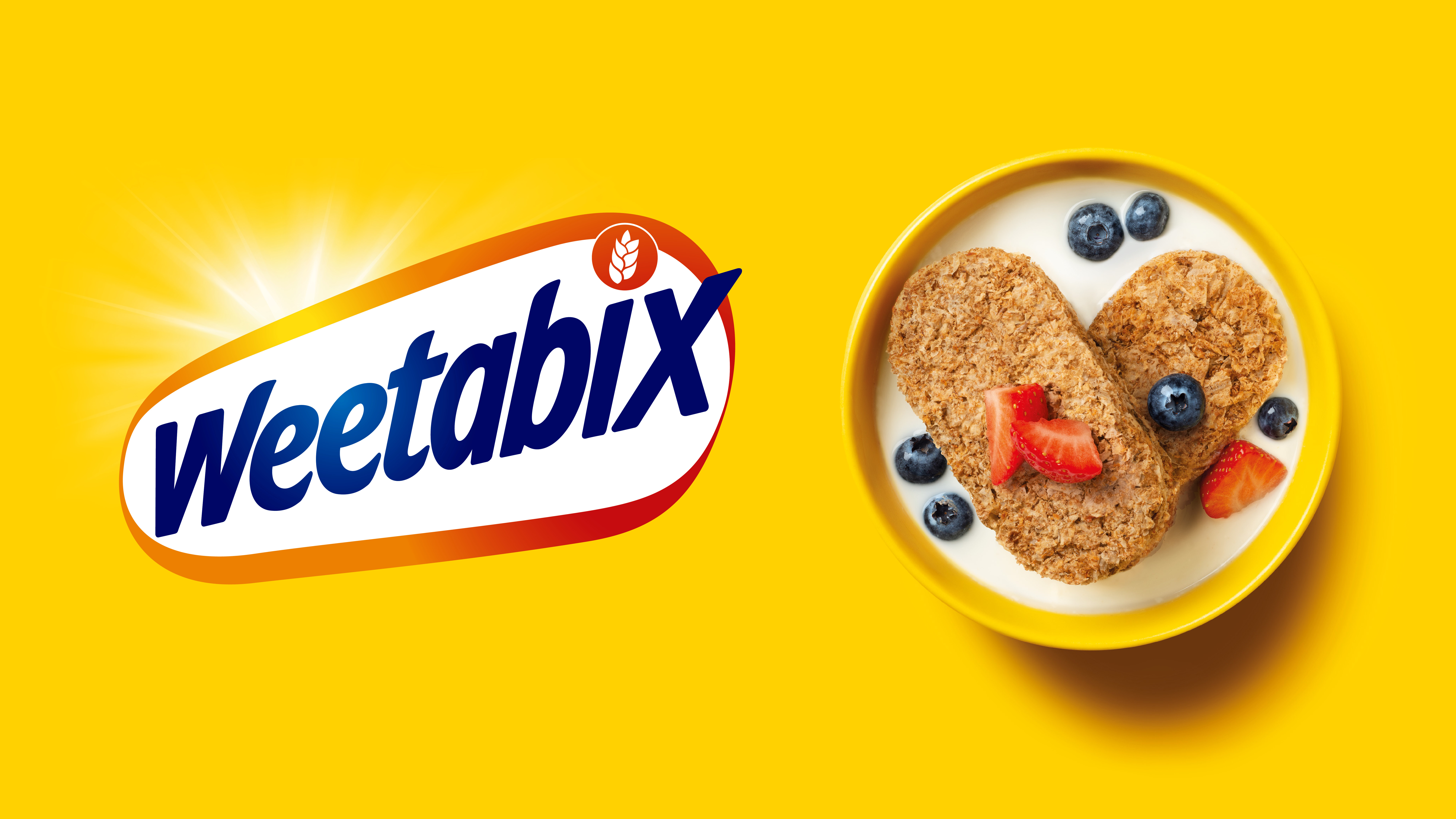
Weetabix and the lozenge
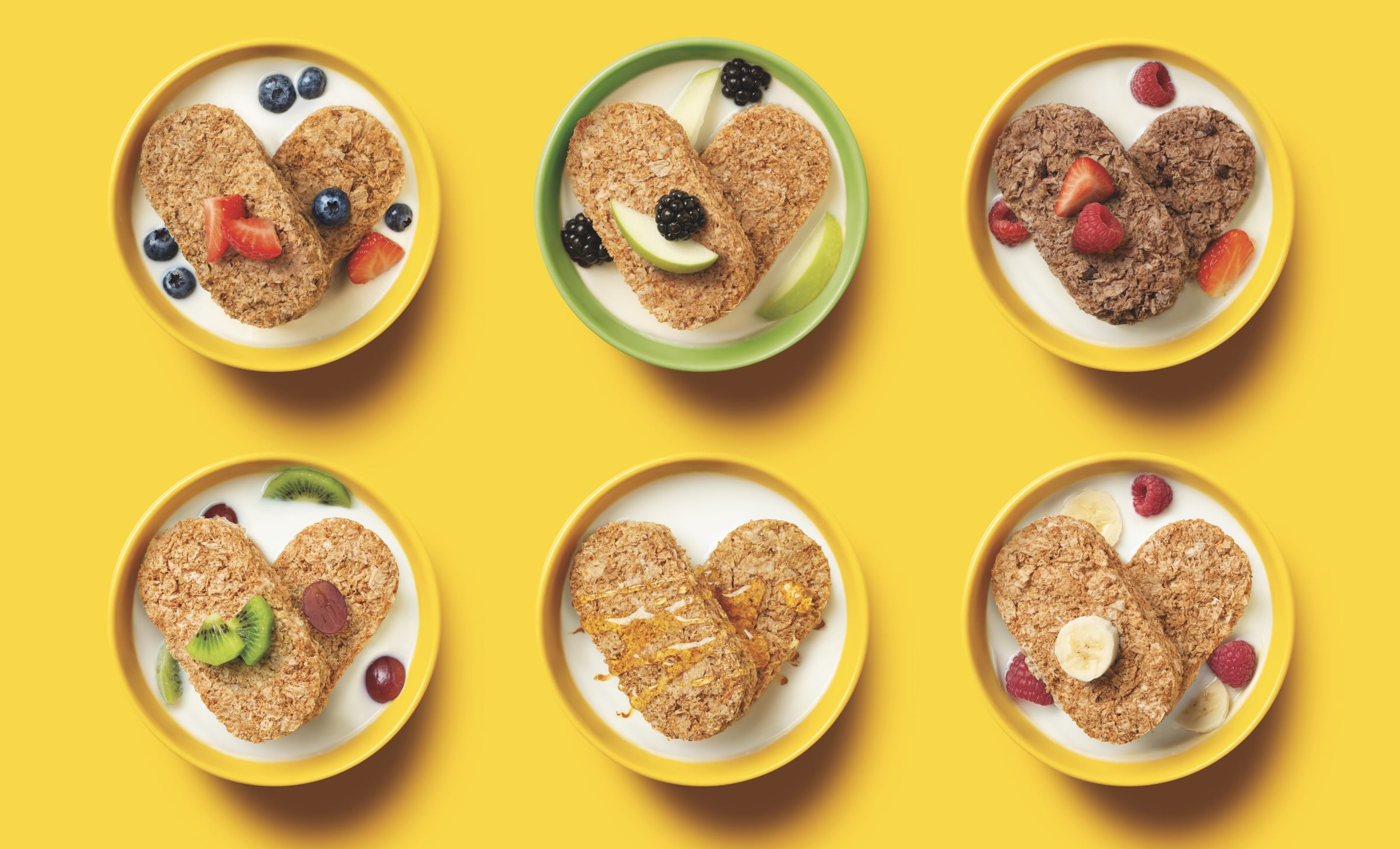
In the case of Weetabix, the iconic shape is the shape of the product itself.
It’s not unusual for packaging to be the icon (Coke, Heinz, Pepto Bismol, Voss – the list goes on), but the product shape itself is harder to own.
Pringles found its distinctive asset across both of these asset categories: the shape of the crisp itself, and the never-done-before tube packaging. It was so distinctive they made special Pringles-shaped carry cases for your lunchbox.
Is your brand ready for travel?
In a growth phase, your brand world should be rich enough to support advertising, content, retail, digital, partnerships, and product expansion.
This is most effectively done by keeping your unique story alive, and finding repeatable signals and shapes that are easily, consistently spotted along the way. Scaling well means codifying what made you special, not diluting it for mass appeal. It means treating assets as infrastructure, not decoration.
The big question is: are you broadening appeal, or sanding away the reasons people chose us in the first place?