Revitalising a classic
Ryvita
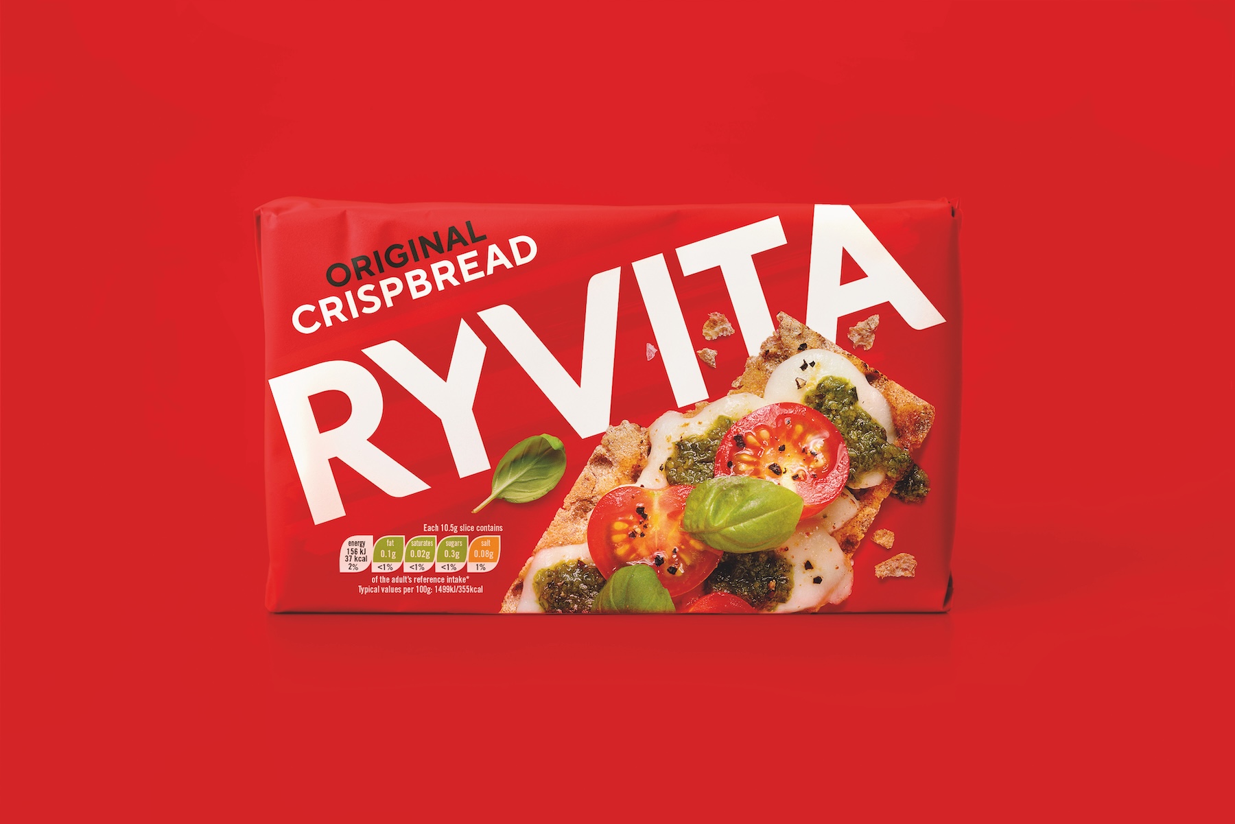
Iconic? Absolutely. But this icon needed to stay relevant. It had fallen out of sync with a booming health food sector: consumers didn’t want compromise, they wanted taste. The challenge was to refresh the promise, and get Ryvita chosen by more people for more occasions.
Rekindling the love
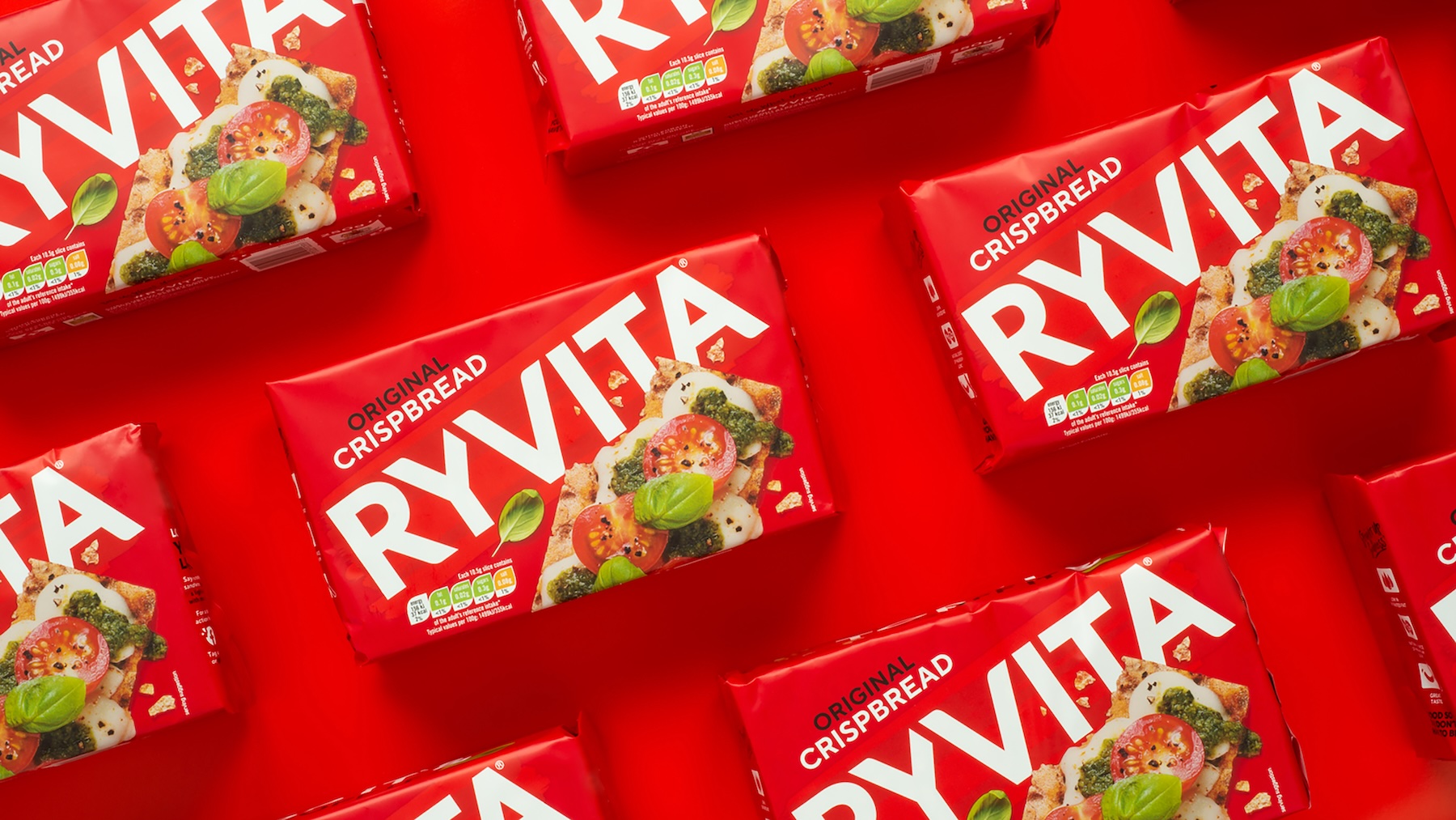
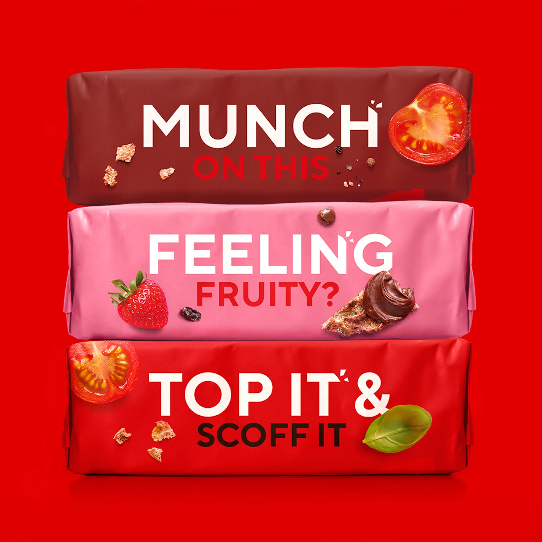
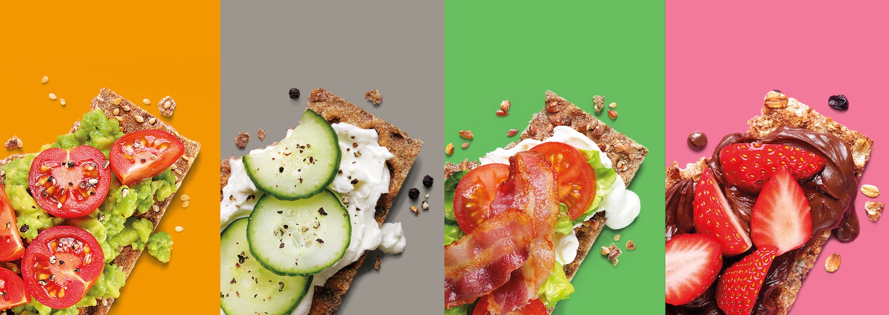
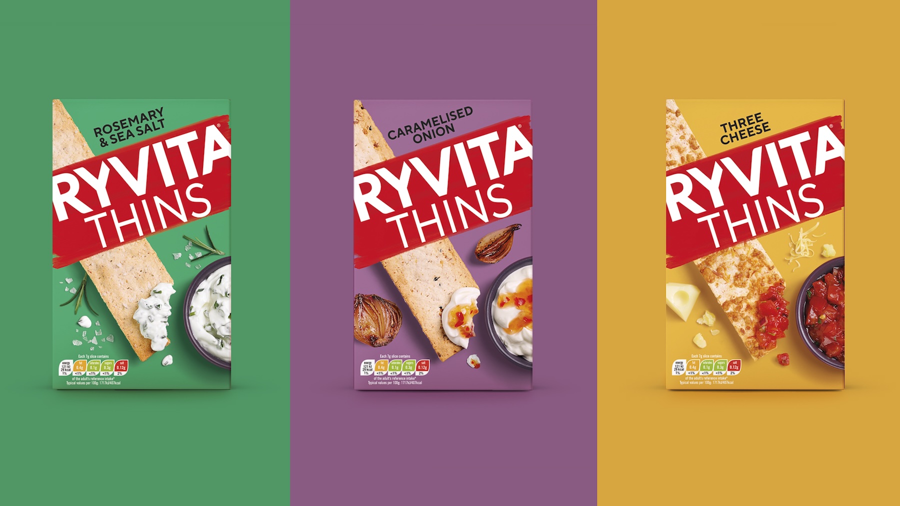
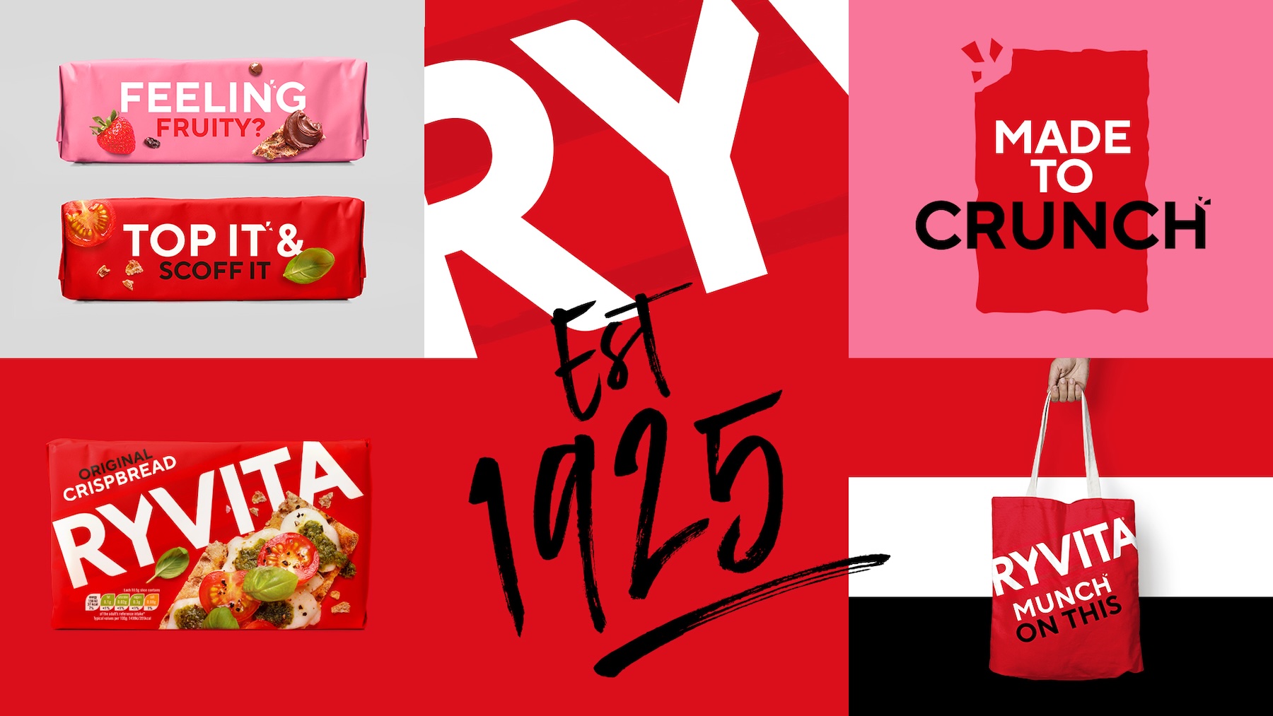
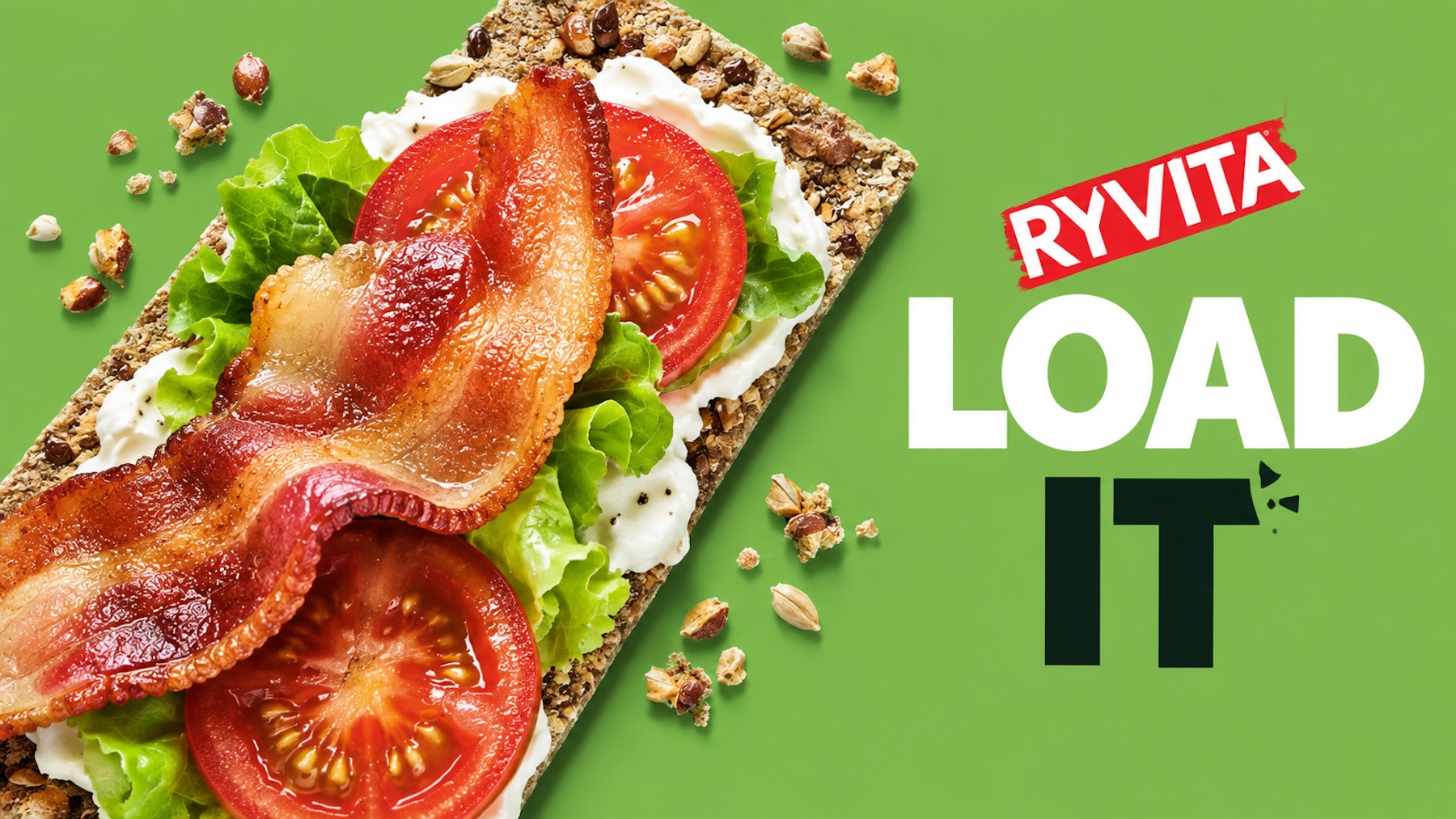
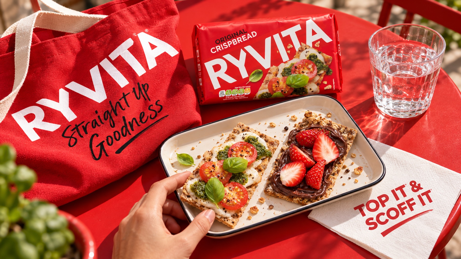
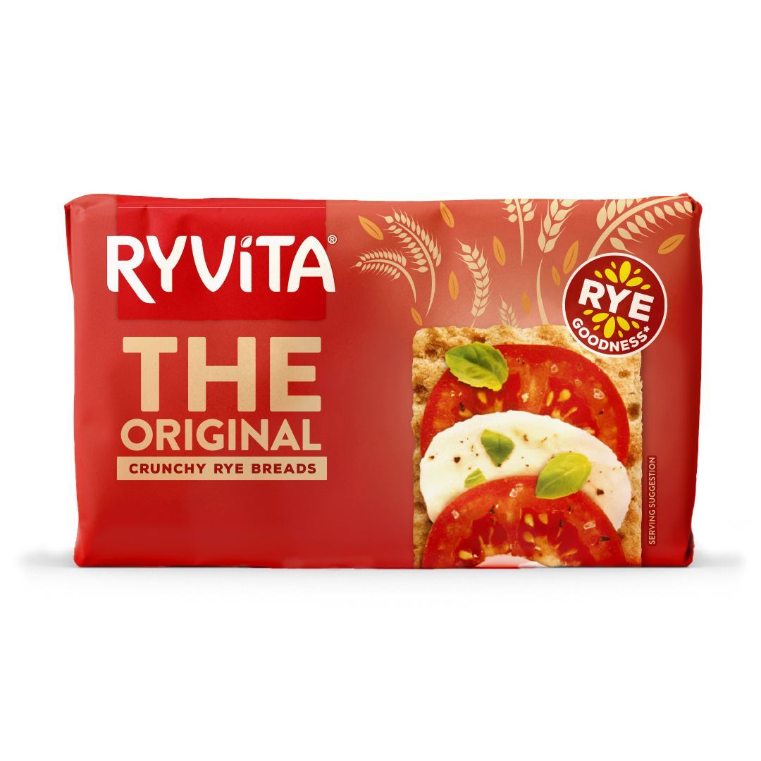
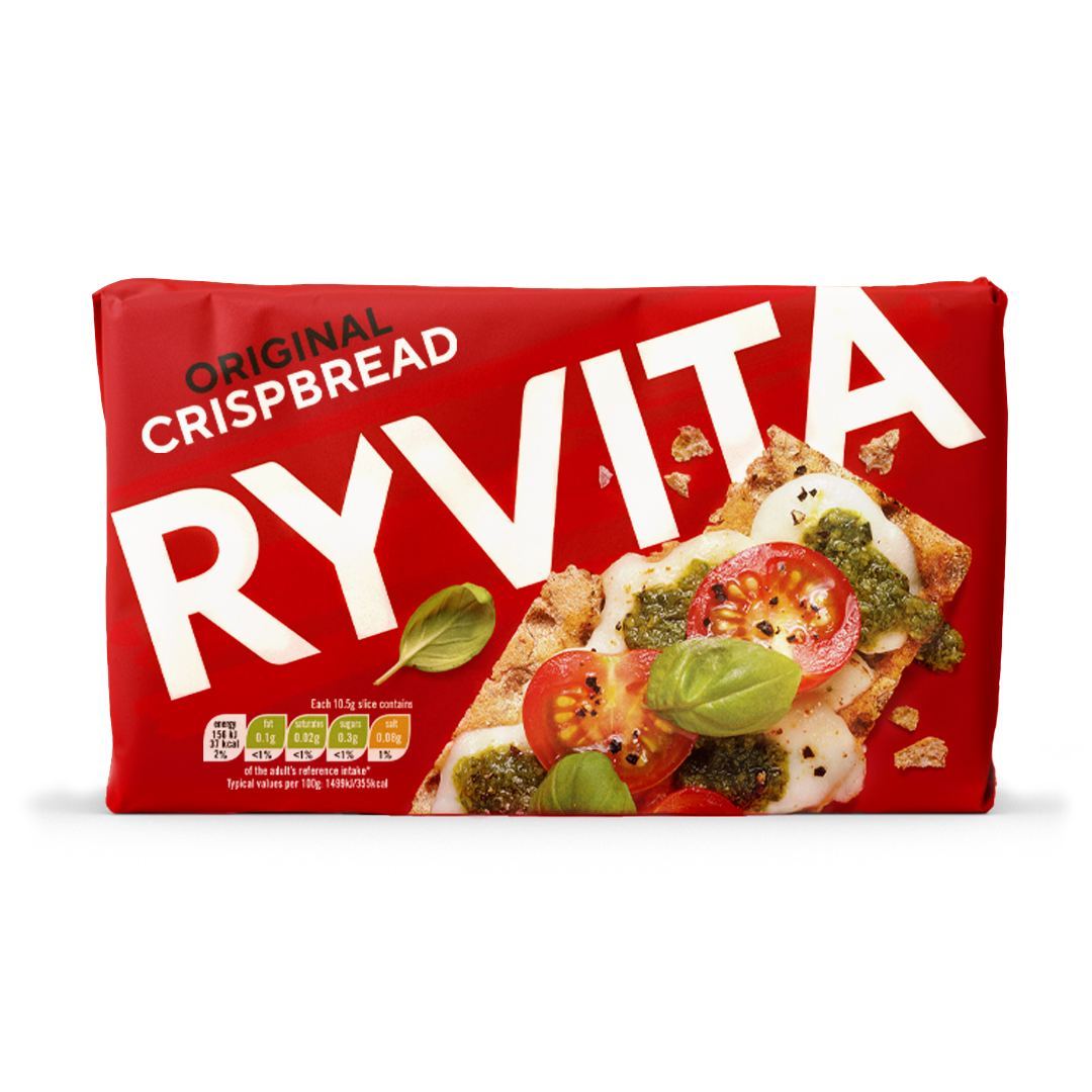
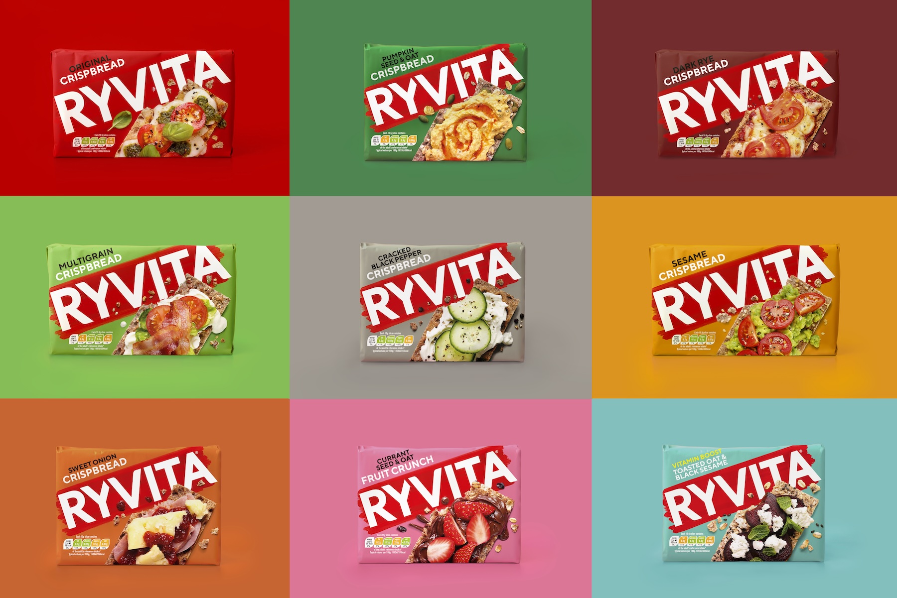
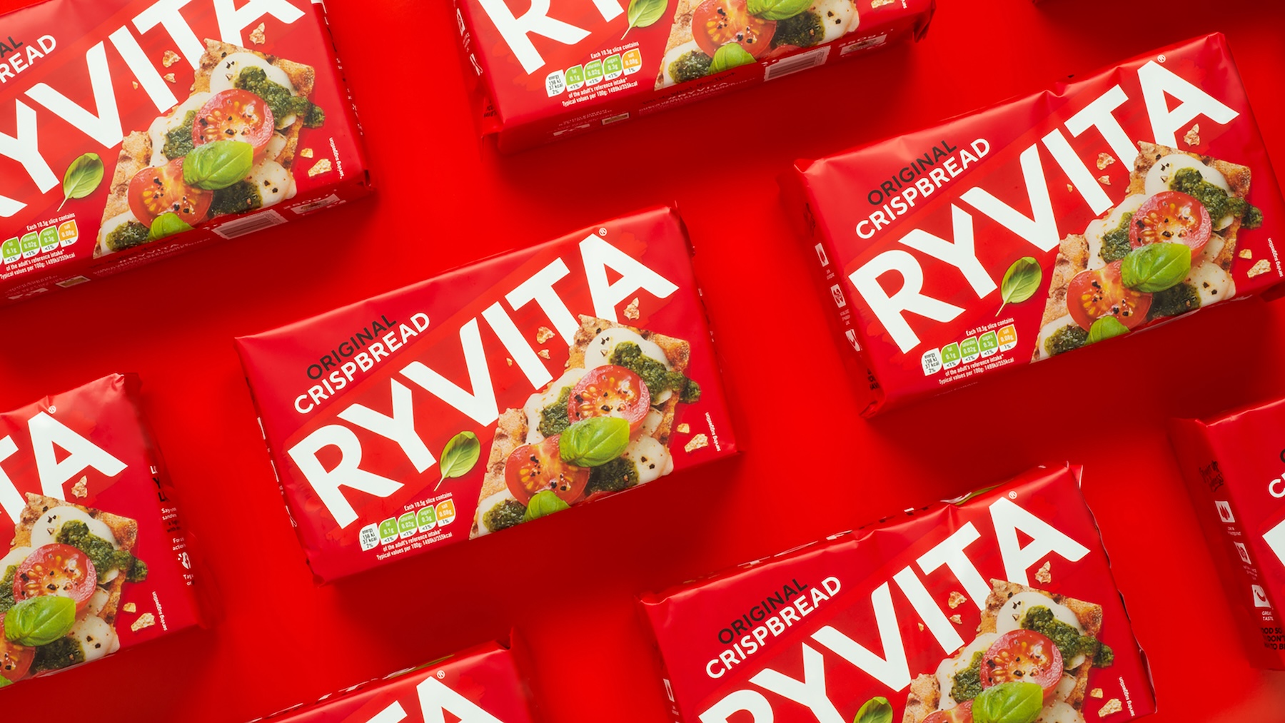
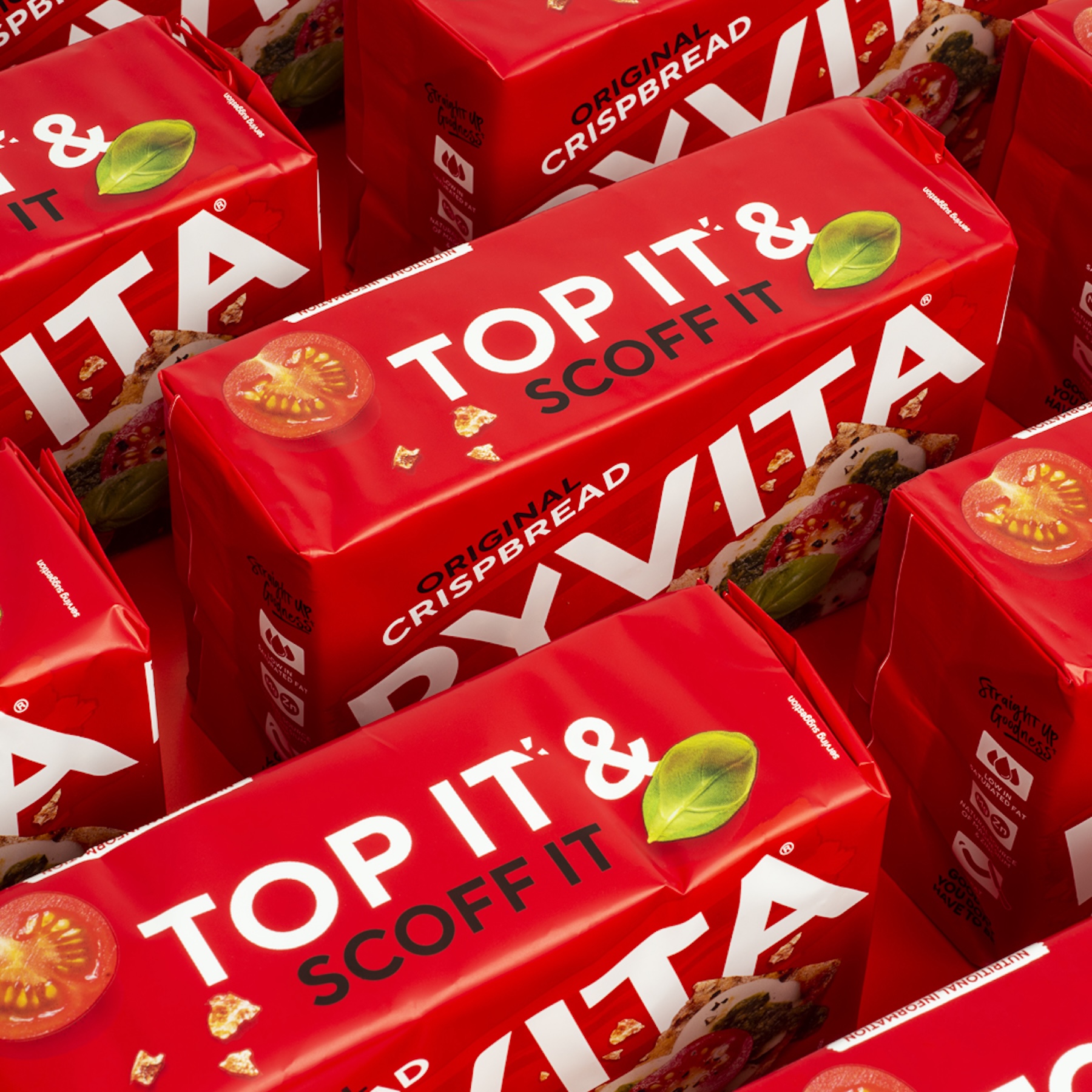
Dating from 1925, Ryvita is, of course, a national treasure, but needed to move with the times. We amplified its distinctive brand assets – the wordmark and bold red background. This powered up its presence in store and made space for an extended design system: a vibrant secondary palette and inspiring serving suggestions, which would support exciting new innovations, without losing familiarity. No longer simply a bread alternative, the semiotics now say food on the go: a whole new category entry point for customers.
Feeding new opportunities
The renewal gave the brand team a new confidence, and turned heads across the sector. There was more life yet in this brand.
- Stat
- 56% sales increase within first year of redesign
- Stat
- 69% repeat purchase within first year of redesign
- Stat
- 2.2% Household penetration within first year of redesign
Gallery